
Why Calming Colors Are Trending for the Home by Gwendolyn Purdom
In the face of rapid-fire headlines and cultural overstimulation, colors in the home seem to be moving in a more tranquil direction. Presentations and conversations at this month’s Design Chicago conference, along with just-announced colors of the year, suggest that major paint brands, designers and homeowners are gravitating toward muted, calming palettes and design choices in general. While world events and the public’s mood aren’t the only factors driving the popularity of soothing colors, experts say people do seem to be looking for comfort and solace at home and that color trends are following suit.

Michael Plank, Sherwin-Williams’ director of color marketing and design, told pros during his Design Chicago 2020 color forecast presentation that wellness is the common thread that stitches together all five palettes his company recently released for next year.
Shelf paint: Acacia Haze, Sherwin-Williams
Those palettes — meant to “bring joy, serenity and focus to the mind, body and spirit,” according to Sherwin-Williams — include Mantra, a collection of dusty pinks and warm beiges influenced by minimalism, serenity and sanctuary, and Haven, a set of richer but still muted blues, greens and grays that draws from simplicity and “beckons to those seeking an oasis,” among others. Other influences Plank touched on in his lecture include the comforting concepts of healthy living, sustainability and even JOMO, the homebody cousin of FOMO (fear of missing out); it stands for “joy of missing out.”
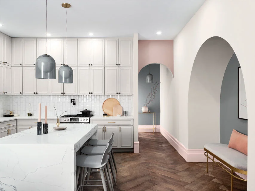
Arch paint: Breathless, Sherwin-Williams; gray wall paint: Software, Sherwin-Williams
SOURCE: Gwendolyn Purdom
Houzz Editorial Staff. Lover of architecture, history, dogs, the Chicago Cubs, crowded bookshelves, and homes with a story. Former editor at Preservation mag and Culturess.com.
http://www.houzz.com/magazine/why-calming-colors-are-trending-for-the-home-stsetivw-vs~127484300